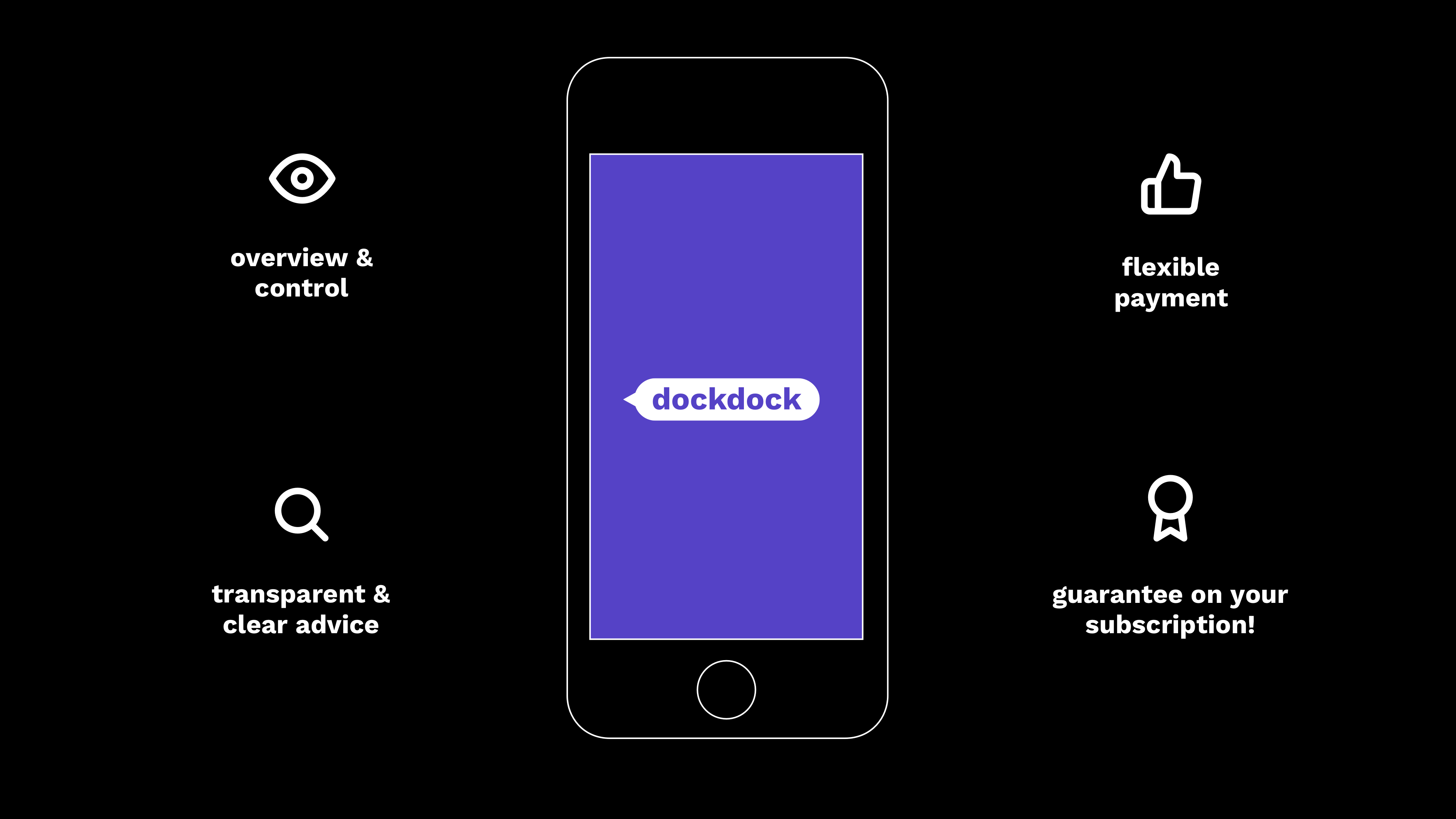
dockdock is a fresh new product out there which consists of a payment app that gives you control over your subscriptions. It takes all your stress away by the means of payment reminders and clear warnings. We were asked at Acato to design the app and its branding (digital and print).
Our challenge was to represent dockdock through its USP’s:
1. Overview and control
2. Transparent and clear advice
3. Flexible payment
4. Guarantee on your subscription
2. Transparent and clear advice
3. Flexible payment
4. Guarantee on your subscription
The branding needed to be friendly and the app easy to use.
In this project, I was mainly responsible for the visual design of the app and had a part in the user experience.
The app
Product USP's
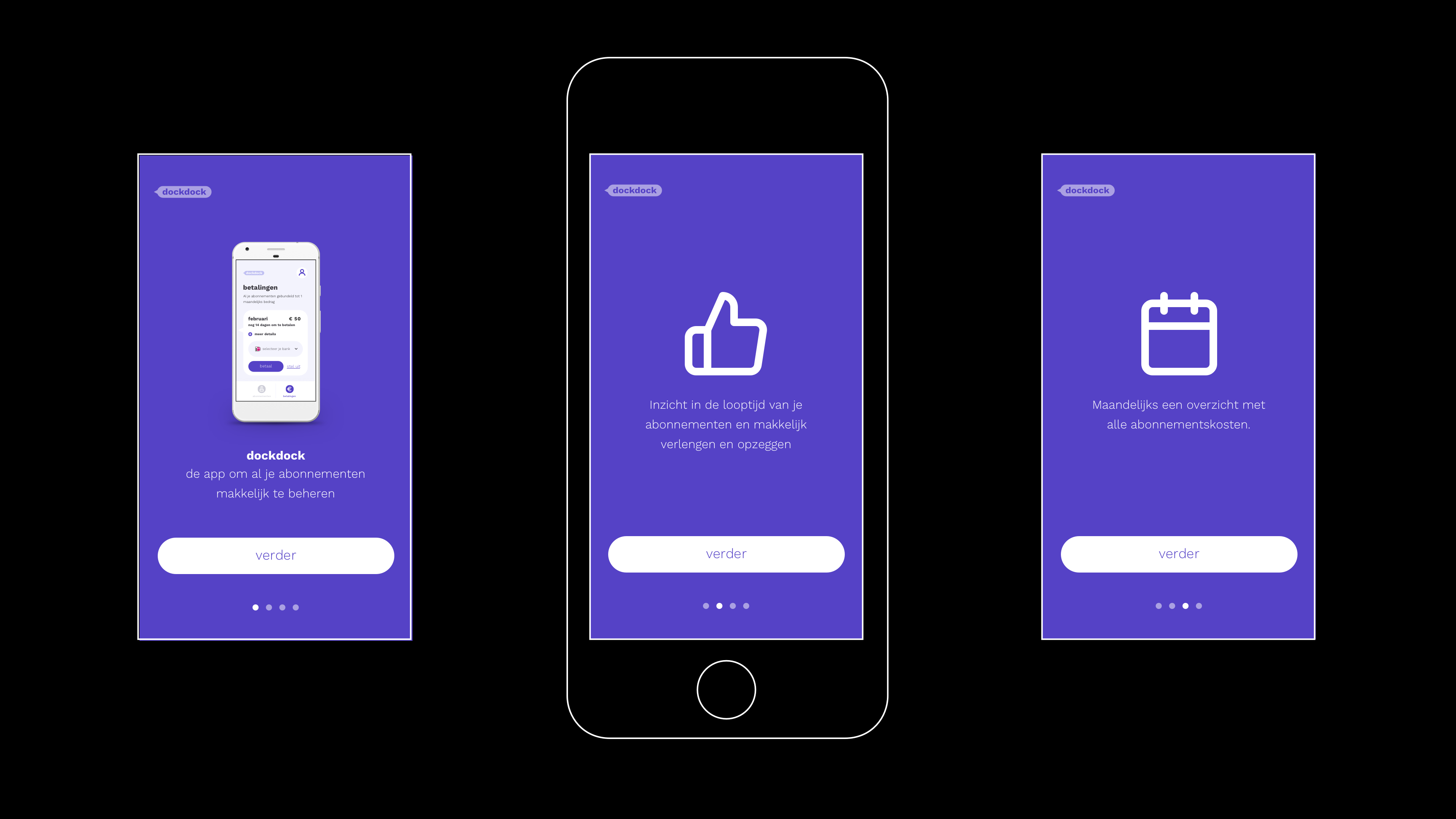
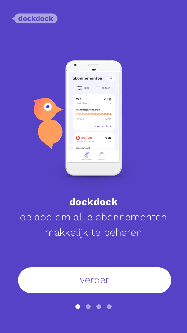
Clear onboarding
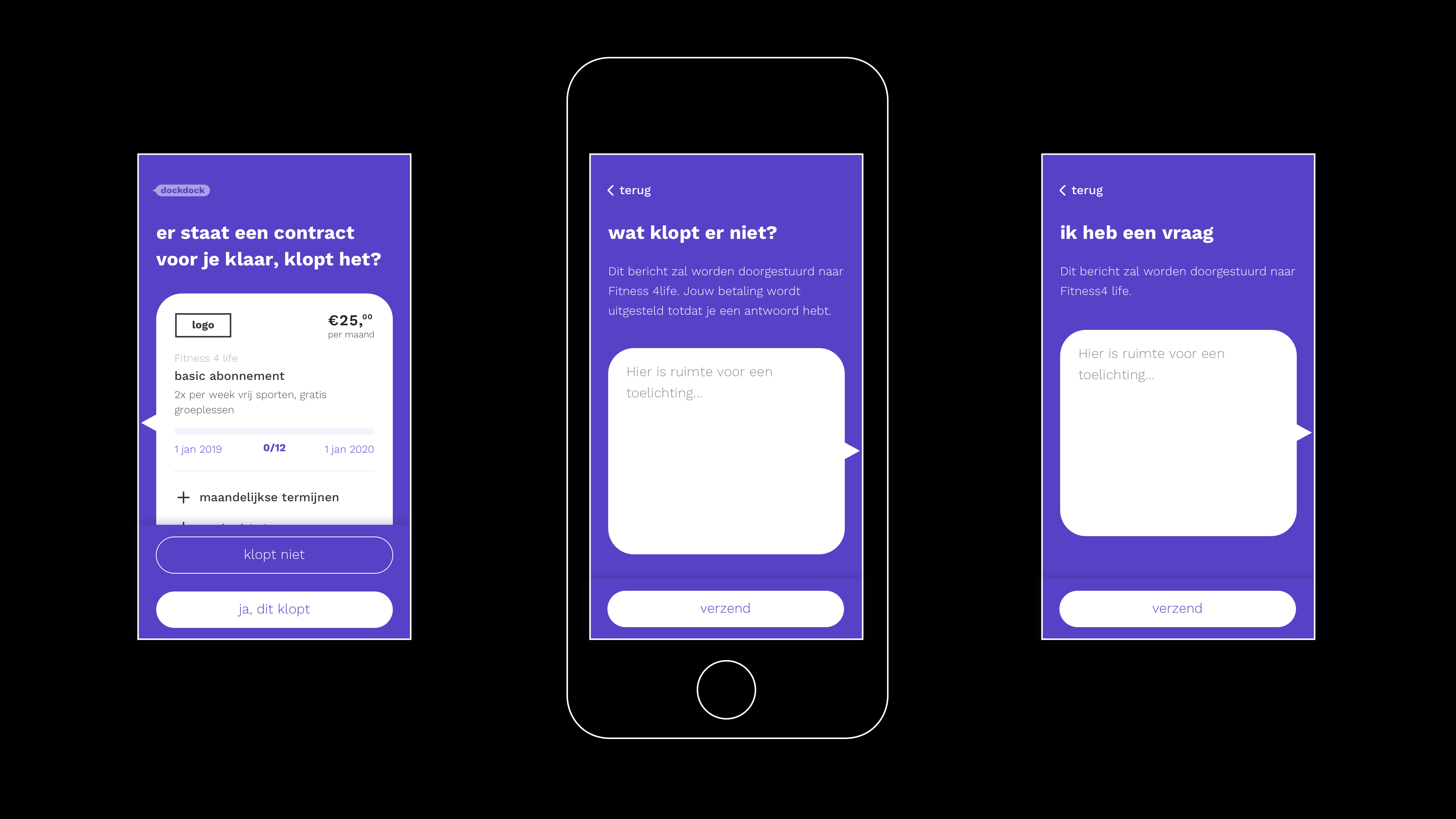
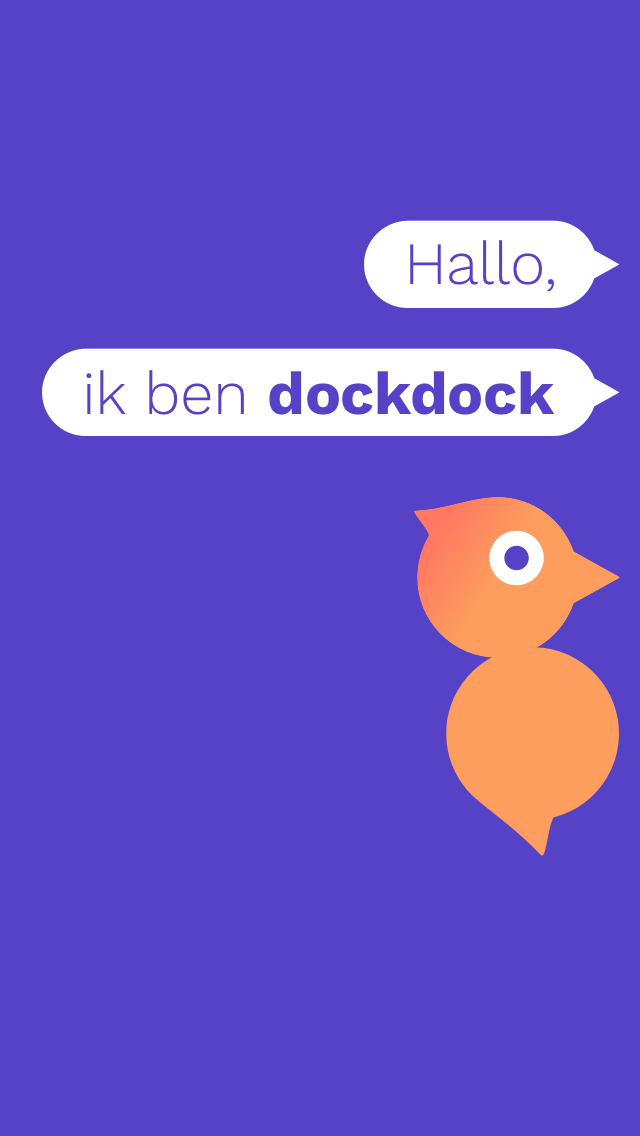
A conversational app
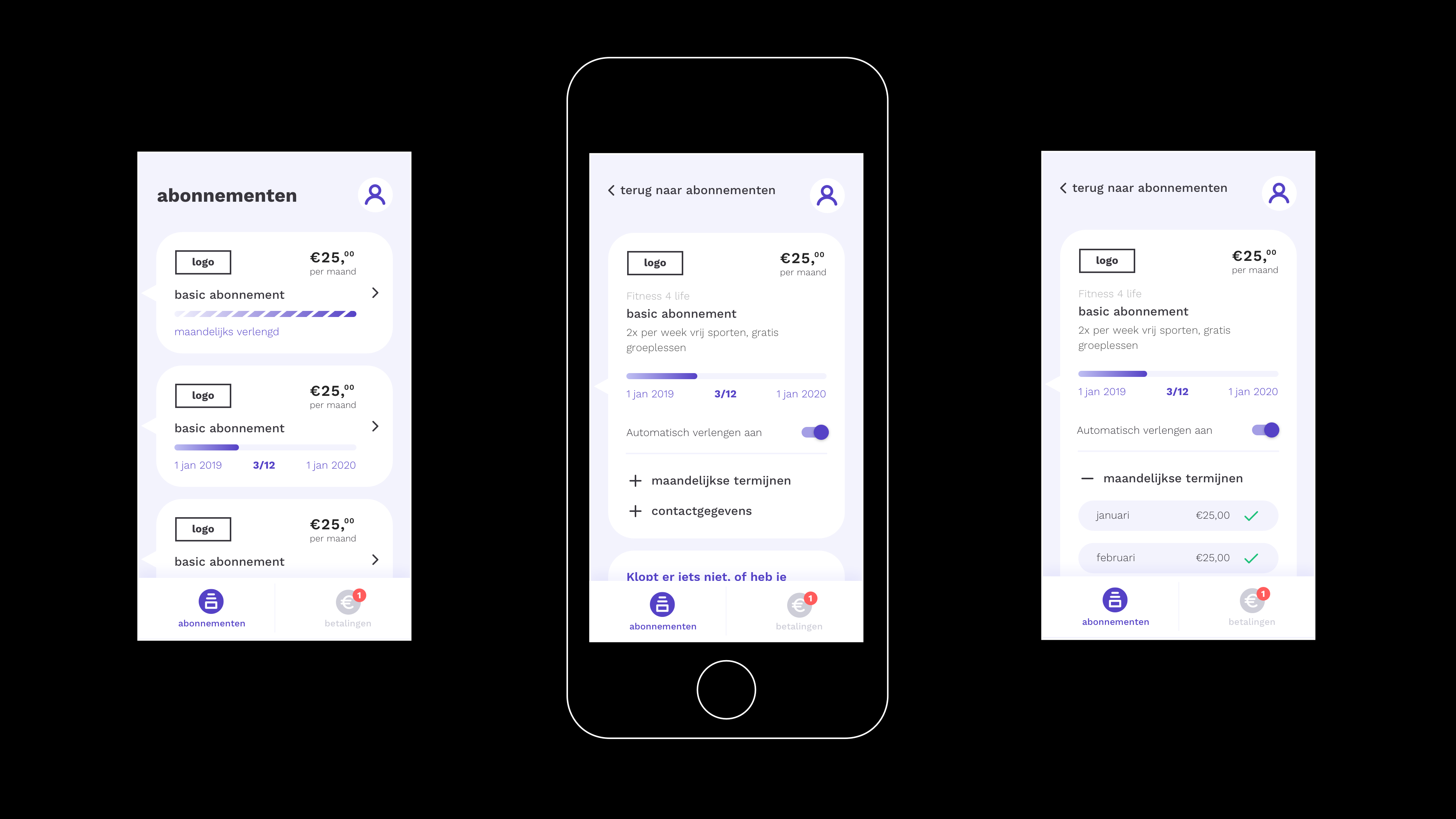
Detailed insights into your subscriptions
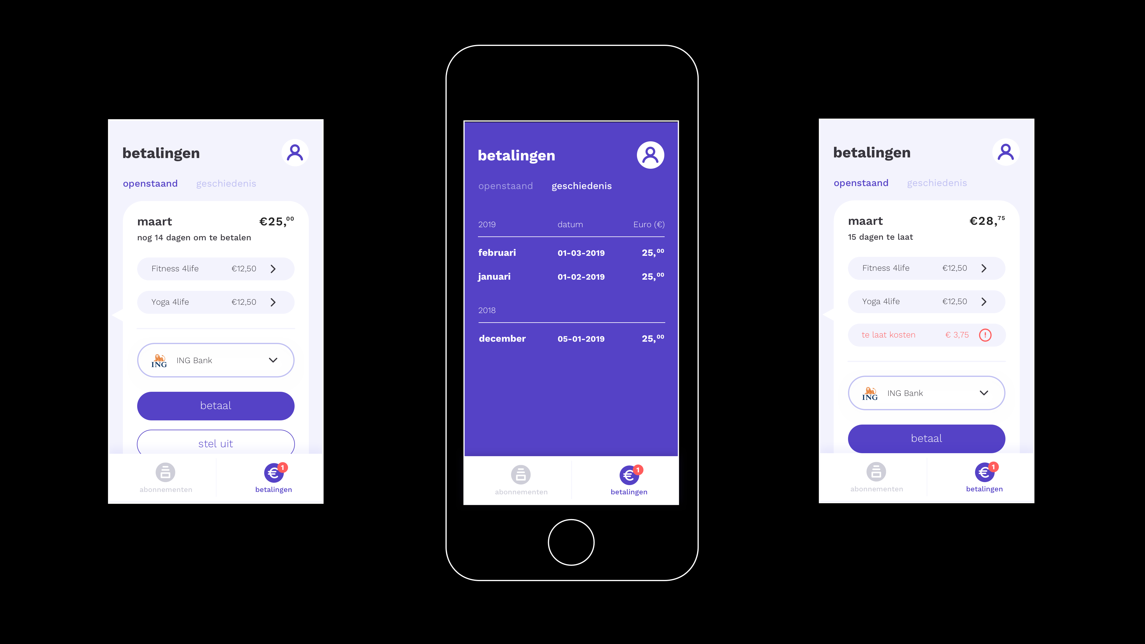
Clear payments overview
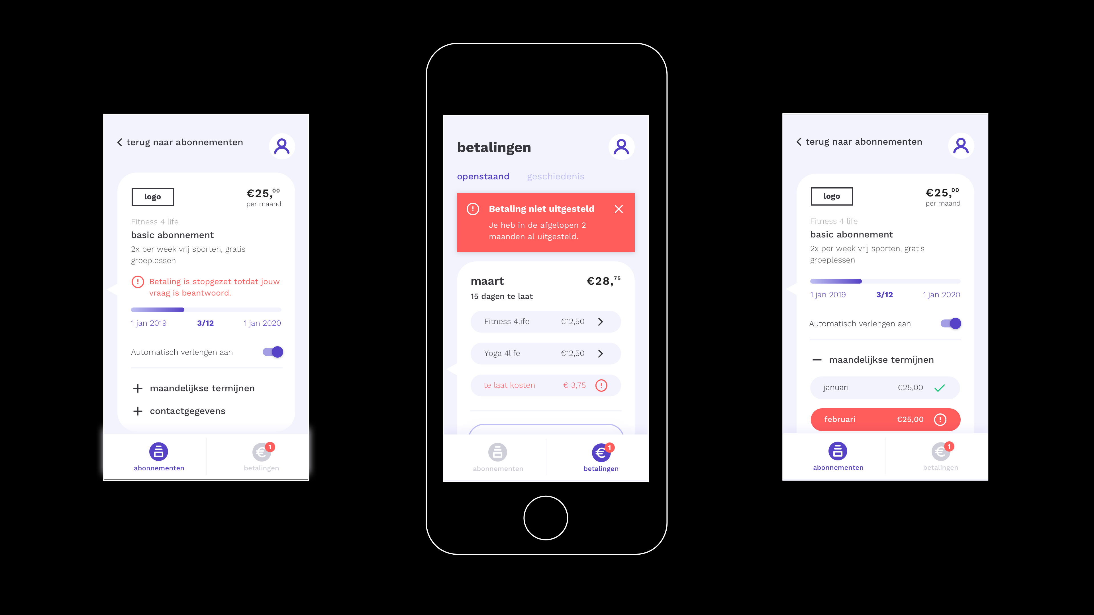
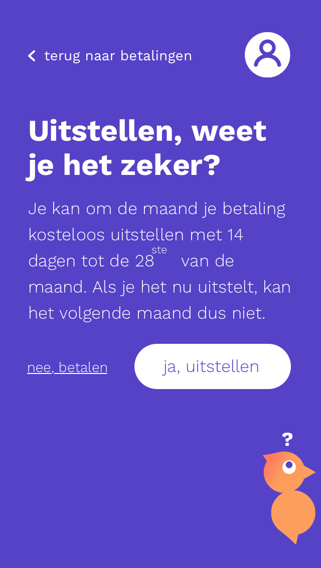
Warnings to help you out
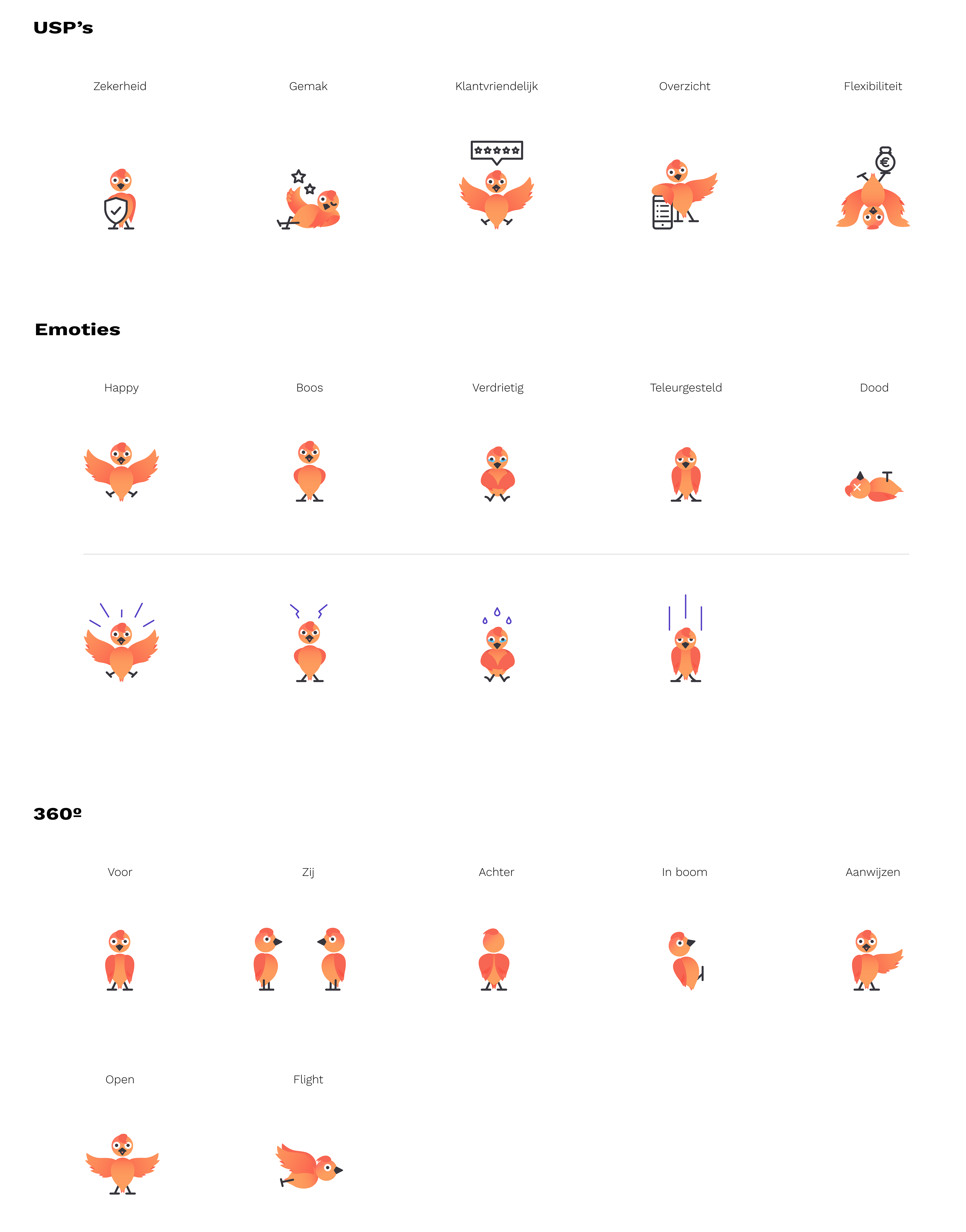
The mascot
dockdock has a woodpecker as mascot. We also pitched the idea to integrate the woodpecker in the app to give tips or warnings. I developed the illustrations and some examples of UI motion to show how it could be integrated to the app.
Credits
UX Annet Van Vulpen, Lisa Siggen
UI Lisa Siggen, Joni Hartog
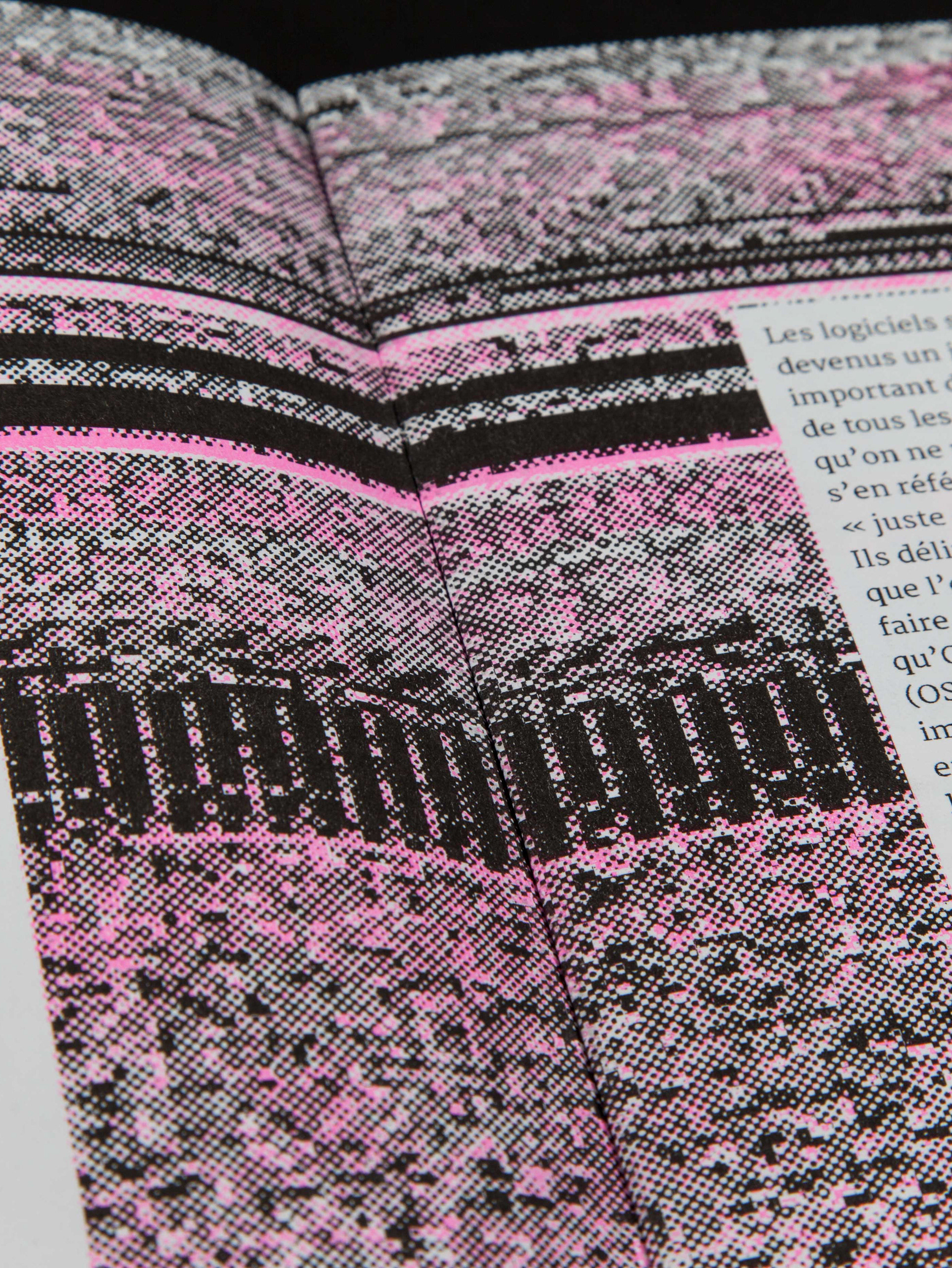
Branding Nellie Keijzer
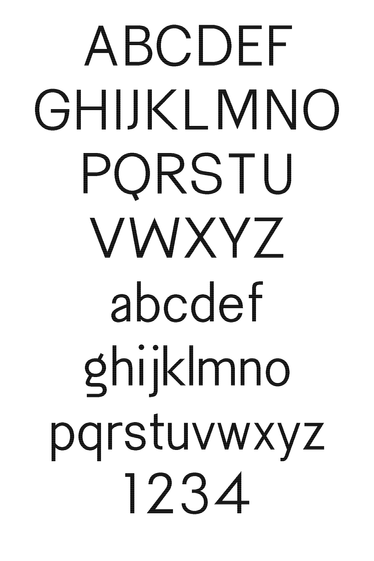
Typeface Work Sans
Tools Illustrator, Sketch
© dockdock and Acato
UX Annet Van Vulpen, Lisa Siggen
UI Lisa Siggen, Joni Hartog
Branding Nellie Keijzer
Typeface Work Sans
Tools Illustrator, Sketch
© dockdock and Acato